The psychology of colour in your bedroom
How colour shapes mood and sleep — the psychology behind common bedroom colour choices, and how to use it intentionally.
Colour does more than decorate. It shapes mood, signals safety or alertness to the nervous system, and can measurably affect how quickly you fall asleep. The bedroom is the one room where this matters most — it's the room you spend a third of your life in, mostly with your eyes closed but always with the colour palette doing its quiet work in the periphery. Understanding the psychology of bedroom colour helps you choose intentionally instead of by accident. Here's how it works.
- Why bedroom colour matters more than other rooms
- Calming colours — the soft neutrals
- Colour and emotion: what each tone does
- The art of combining
- Beyond colour: the role of material
Why bedroom colour matters more than other rooms
Visual stimuli still register even with eyes closed. Your brain processes ambient light and tonal contrast continuously through the night. A high-contrast, bright bedroom keeps the visual cortex slightly alert; a low-contrast, soft-toned bedroom lets it power down. The difference shows up in how quickly you fall asleep and how deeply you stay there.
This isn't a niche claim — sleep researchers have studied bedroom environment for decades, and colour palette consistently shows up as one of the variables that matters. Not as much as light or temperature, but more than most people assume.
Calming colours — the soft neutrals
The bedrooms most people sleep best in lean toward soft, low-saturation colours. Whites, soft greys, muted blues, sage greens, warm taupes, and dusty pinks all work for the same underlying reason: they're low-stimulation. The eye relaxes. The brain follows.
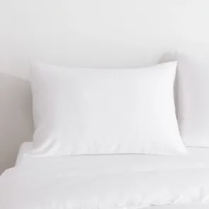
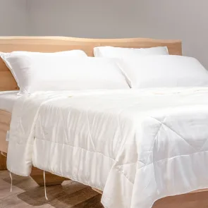
- White / Coco White — clean, fresh, timeless. The blank canvas that lets accessories do the talking
- Soft blues / Space Blue — measurably calming; lower blood pressure and slower heart rate are documented effects
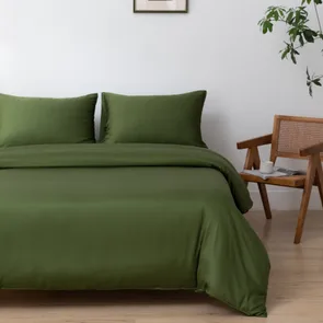
- Muted greens / Sage Green / Deep Moss — the colours of nature; deeply restful
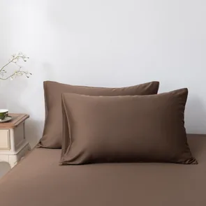
- Warm neutrals / Soft Taupe / Coffee Brown — grounded, calm without being cold
- Soft pinks / Cuddle Pink — warm, comforting, with the calming effect of a hug
- Soft purples / Lavender Mist — calm and slightly aspirational; the colour of dusk
Colour and emotion: what each tone does
Each colour family carries its own associations, and the science behind them is more solid than people expect:
- White: bright, simple, timeless. Creates a feeling of space and calm. Best for minimalist bedrooms or as a base for accent colours
- Blue: consistently calming, suggests stability and clarity. Good for high-stress sleepers or anyone who finds it hard to wind down
- Green: restful, natural, balancing. The colour the eye finds easiest to look at. Particularly good for rooms with houseplants
- Grey and beige: modern, understated, warm without being overwhelming. Excellent foundations for layered styles
- Brown: grounding, secure, warm. Works particularly well in rooms with natural materials like wood and stone
- Pink (soft): warm, kind, lowers visual stress. Often surprises people who didn't think pink was their colour
- Purple (soft): calm with a hint of richness. Walks the line between restful and slightly aspirational
For deeper takes on individual colours, see Cuddle Pink, Space Blue, or Sage Green styling.
The art of combining
The best bedrooms aren't monochrome — they're tonal. Stay within a related family of colours and the room reads as intentional and calm. A few combinations that consistently work:
- Coco White + Sage Green — fresh and natural
- Soft Taupe + Cuddle Pink — earthy and warm
- Coco White + Space Blue — classic and clean
- Lavender Mist + Soft Taupe — calm and elegant
- Deep Moss + warm wood — botanical and grounded
Avoid combining too many strong colours. A bedroom isn't a living room — visual quietness pays off in sleep quality.
Beyond colour: the role of material
Colour is half the equation. Texture is the other half. The same shade reads completely differently on cotton, linen, polyester, or bamboo — and bamboo's natural sheen gives every colour a quiet depth that flat fabrics can't replicate.
This is why bedding choice and colour choice should be made together rather than separately. A warm, well-styled bedroom palette in cheap, flat fabric still feels off. The same palette in bamboo bedding feels intentional and complete.
For a deeper look at how style and colour come together, see our guide on 10 tips for an appealing bedroom or browse the full bamboo collection.
OUR CATEGORIES

ANOTHER TALE BEFORE BEDTIME